Project: Visualization of paths from factual to counterfactual
Description
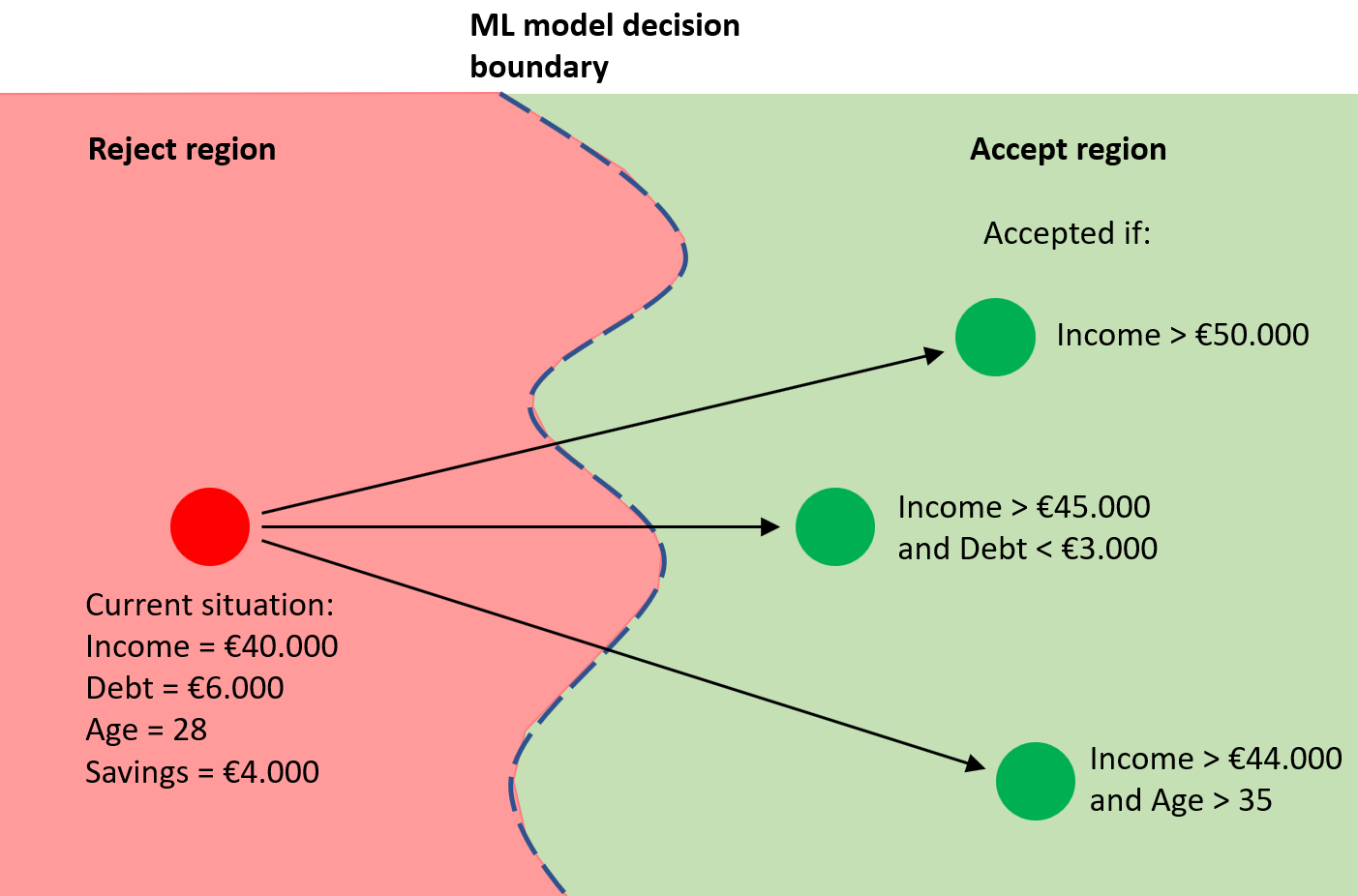
When
a machine learning classification has been made and the user disagrees with the
prediction, he or she wants to know what needs to be changed to get a (better)
different outcome. Calculating this is a part of machine learning called
counterfactuals and recourse. This calculation can be performed in many ways,
and it's not clear what the best way is. The idea is that with domain
knowledge, the user can determine what the 'best' way is. Often, the data (the
factuals) and the counterfactuals are plotted on a two-dimensional map using
dimensionality reduction. This map is typically enriched with arrows showing how
to go from the factual to the counterfactual. Most often the arrows are rendered
straight. However, due to the non-linear dimensionality reduction the space is
distorted and a straight arrow is no longer a truthful representation of the
path from factual to counterfactual. For example, a shorter arrow is not necessarily
a better/easier path from factual to counterfactual, but a longer arrow might
actually be easier.
In
this project, we want to explore better ways to visualize the actions and path from
factual to counterfactual (for example by enriching the embedding with decision
boundaries and non-straight arrows that better represent the actions/path from
factual to counterfactual).
Requirements
- Good programming skills
- Understanding of ML models
and their inner working, ideally also explainable methods and counterfactuals.
- Visualization background
Details
- Supervisor
-
 Stef van den Elzen
- Interested?
- Get in contact