back to list
Project: Explainable Visual Analytics for Composite Indices
Description
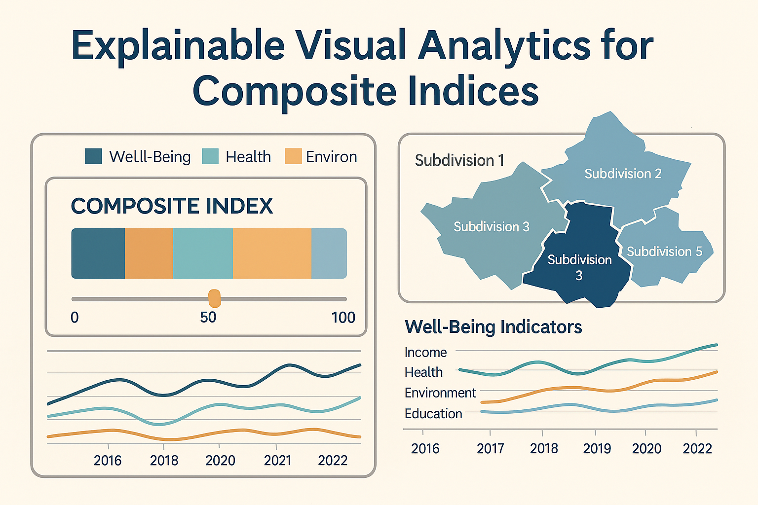
Composite indices are widely used to summarize complex, multi‑dimensional phenomena—such as well‑being, sustainability, competitiveness, or quality of life—into a small number of aggregate scores. These indices typically combine many underlying indicators using normalization, weighting, and aggregation steps. While effective for comparison and communication, such aggregation can hide important details about indicator contributions, trade‑offs, and assumptions.
As a result, users often struggle to answer questions such as:
- Why does one region score higher than another?
- Which indicators drive changes over time?
- How sensitive are results to weighting choices?
Explainable Visual Analytics aims to address these challenges by combining interactive visualization with analytical support, enabling users to explore, understand, and question composite indices rather than treating them as black boxes.
Project Objective
The objective of this project is to design, implement, and evaluate an interactive, explainable visual analytics system that supports transparency and understanding of composite indices. The system will help users explore how underlying indicators contribute to aggregated scores and how alternative modeling choices affect outcomes.
Example Data Context (CBS as Use Case)
As a realistic and well‑scoped example, the project may use open statistical data from the Centraal Bureau voor de Statistiek (CBS). CBS publishes rich, multivariate datasets that are commonly used to construct composite indices, such as:
- Well‑being and quality‑of‑life indicators (e.g., income, health, environment, education)
- Regional socio‑economic statistics at national, provincial, or municipal levels
- Longitudinal data enabling comparison across years
CBS data is accessible via StatLine and the CBS Open Data API and provides a representative example of the type of official statistics for which composite indices are frequently constructed. However, the visual analytics methods developed in this project are intended to be domain‑independent and applicable to other composite indices.
Research Questions
- How can visual analytics techniques make the construction and interpretation of composite indices more transparent?
- Which visual and interaction techniques best support the explanation of indicator contributions and weighting effects?
- How does interactive exploration of alternative aggregation scenarios influence user understanding and insight?
Expected Outcomes
- An interactive visual analytics prototype for explainable exploration of composite indices.
- Design insights and guidelines for visual explanation of aggregated indicator models.
- Evaluation results demonstrating how explainability supports understanding and informed reasoning.
Relevance and Contribution
This project contributes to visual analytics research by addressing the challenge of explainability in aggregated statistical models, a topic relevant to policy analysis, official statistics, and public data communication. Using CBS data as an example ensures realism and societal relevance while keeping the methods broadly applicable to other domains and datasets.
Details
- Supervisor
-
 Fernando Paulovich