Project: "Canvas Wrapped": Mobile-first, shareable visualizations of Canvas data
Description
Learning Management Systems (LMS) like Canvas collect detailed data about how students use those systems, for example what pages are accessed, when, and how often, as well as how students interact with videos, quizzes, assignments, forums, etc. Students could gain valuable insights about their own behavior and engagement with their studies from this data. However, this data is usually not easily accessible for students. Research in learning analytics [1] has produced many dashboards targeting both students and teachers to present these rich datasets in usable and actionable ways, using visualization. However, students often don't use, or only superficially engage with dashboards. This lack of use has resulted in minimal impact of learning dashboards on learning outcomes [2]. Data storytelling and narrative visualization [3,4,5] provide a potentially more engaging way to communicate this data to students.
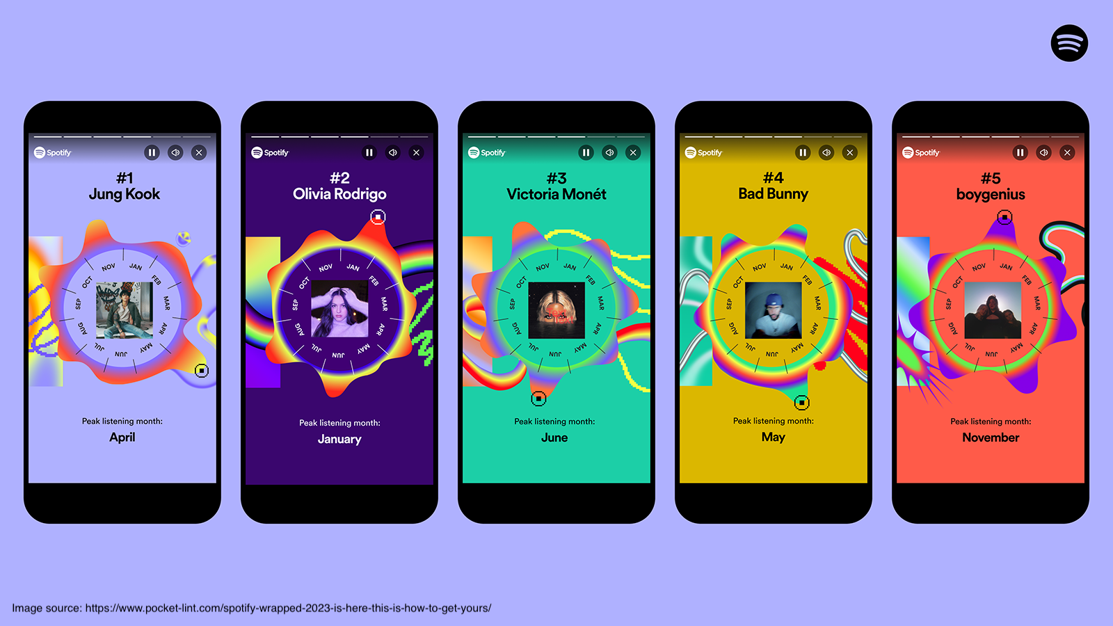
In this project you will explore an alternative – and hopefully more engaging – approach to make LMS data available to students inspired by Spotify Wrapped and similar end-of-year recaps. Spotify Wrapped presents Spotify users an overview of their music listening at the end of each calendar year, including summary statistics and visualizations of data such as minutes listened to different artists. Spotify Wrapped is popular and users often view it as soon as it becomes available, share it on social media and in person, and discuss and compare with friends. Could "Canvas Wrapped" create a similar level of engagement around students' use of learning management systems throughout a quartile or academic year?
Objectives
- Analyze how Spotify Wrapped (and similar) use visualizations
- Define goals for how students should engage with Canvas data
- Design visualizations to achieve these goals
- Develop software to automatically generate visualizations of Canvas data in a mobile-first, "story" format based on your insights from analyzing Spotify Wrapped
You are encouraged to bring your own ideas and interests into this project, as long as the focus remains on using novel forms of visualization to increase student engagement with the Canvas data we provide. In particular, we are open to other ideas for formats to explore beyond "Spotify Wrapped" style recaps.
Required Skills
In this project you will need to process the raw Canvas data and develop a system that can automatically generate data stories from a provided dataset. You can freely choose your tools and programming language, but likely a combination of Python and JavaScript would be best. You do not need prior knowledge on learning analytics.
References
[1] Verbert, Katrien, Erik Duval, Joris Klerkx, Sten Govaerts, and José Luis Santos. “Learning Analytics Dashboard Applications.” American Behavioral Scientist 57, no. 10 (2013): 1500–1509. https://doi.org/10.1177/0002764213479363
[2] Rogers Kaliisa, Kamila Misiejuk, Sonsoles López-Pernas, Mohammad Khalil, and Mohammed Saqr. "Have Learning Analytics Dashboards Lived Up to the Hype? A Systematic Review of Impact on Students' Achievement, Motivation, Participation and Attitude". In Proceedings of the 14th Learning Analytics and Knowledge Conference (LAK '24). Association for Computing Machinery, New York, NY, USA (2024), 295–304. https://doi.org/10.1145/3636555.3636884
[3] Segel, E., and J. Heer. “Narrative Visualization: Telling Stories with Data.” IEEE Transactions on Visualization and Computer Graphics 16, no. 6 (2010): 1139–48. https://doi.org/10.1109/TVCG.2010.179
[4] Lee, Bongshin, Nathalie Henry Riche, Petra Isenberg, and Sheelagh Carpendale. “More Than Telling a Story: Transforming Data into Visually Shared Stories.” IEEE Computer Graphics and Applications 35, no. 5 (2015): 84–90. https://doi.org/10.1109/MCG.2015.99
[5] Hullman, Jessica, and Nick Diakopoulos. “Visualization Rhetoric: Framing Effects in Narrative Visualization.” IEEE Transactions on Visualization and Computer Graphics 17, no. 12 (2011): 2231–40. https://doi.org/10.1109/TVCG.2011.255
Details
- Supervisor
-
 Sarah Schöttler
- Secondary supervisor
-
RCRianne Conijn (HTI)
- Interested?
- Get in contact