back to list

Project: Visualization of airport and flight data
Description

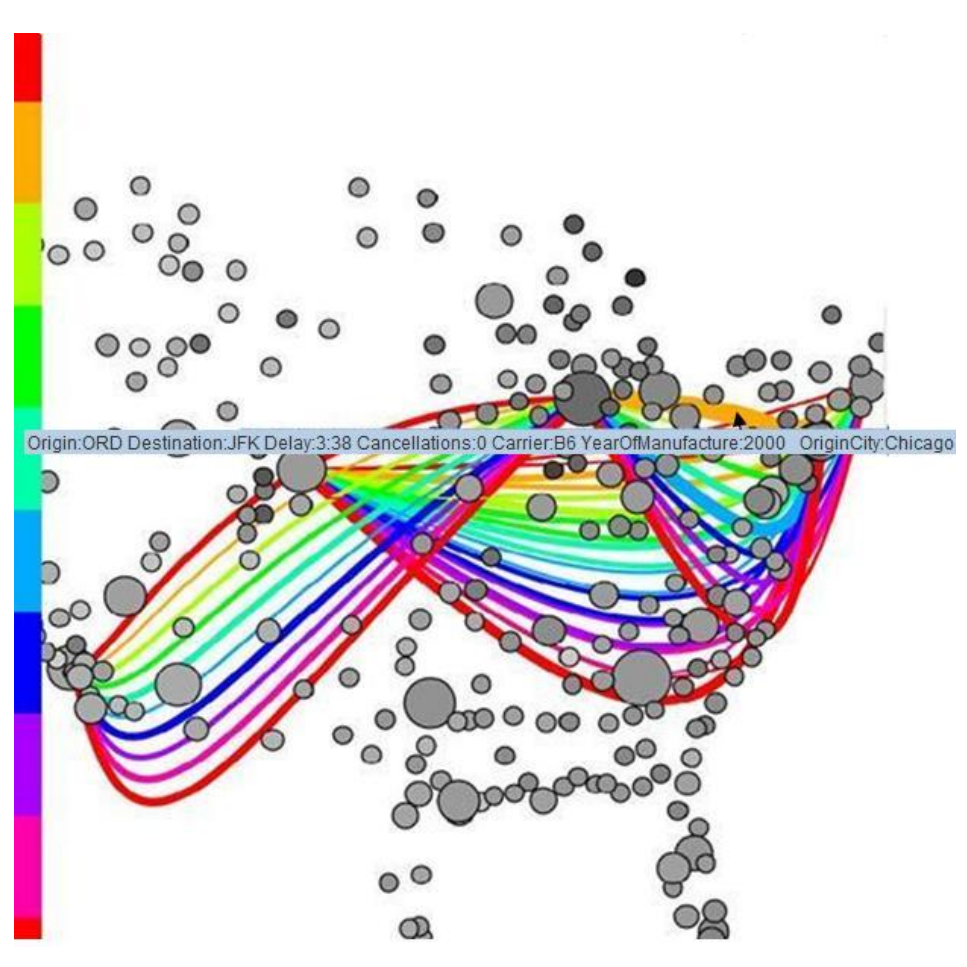
A frequent flyer, an airport official or an airline company may have several questions related to the flights and airports and the delays caused in them. This information can be provided in form of complex tables. It is not so easy to interpret these tables. This project deals with the creation of an interactive tool called AirV is which visualizes these results instead of displaying it in the form of tables. The tool uses a framework called Prefuse to create visualizations. The usage of this tool is discussed with the help of examples. In the end, the pros and cons of the tool are discussed.
Details
- Student
-
PAPavithra Acharya
- Supervisor
-
 Huub van de Wetering
- Link
- Thesis