Project: Visualization of progressive aggregate queries
Description

This research will focus on exploring and analyzing the ways in which progressive aggregate query results can be visualized and presented to the user in the most informative, actionable way. Furthermore, ways to utilize the visualization as an interface by the user to further explore the data. The work will be carried out in accordance with the following extended Hetzler et al.’s design guidelines for dynamic visualization, stating that it should:
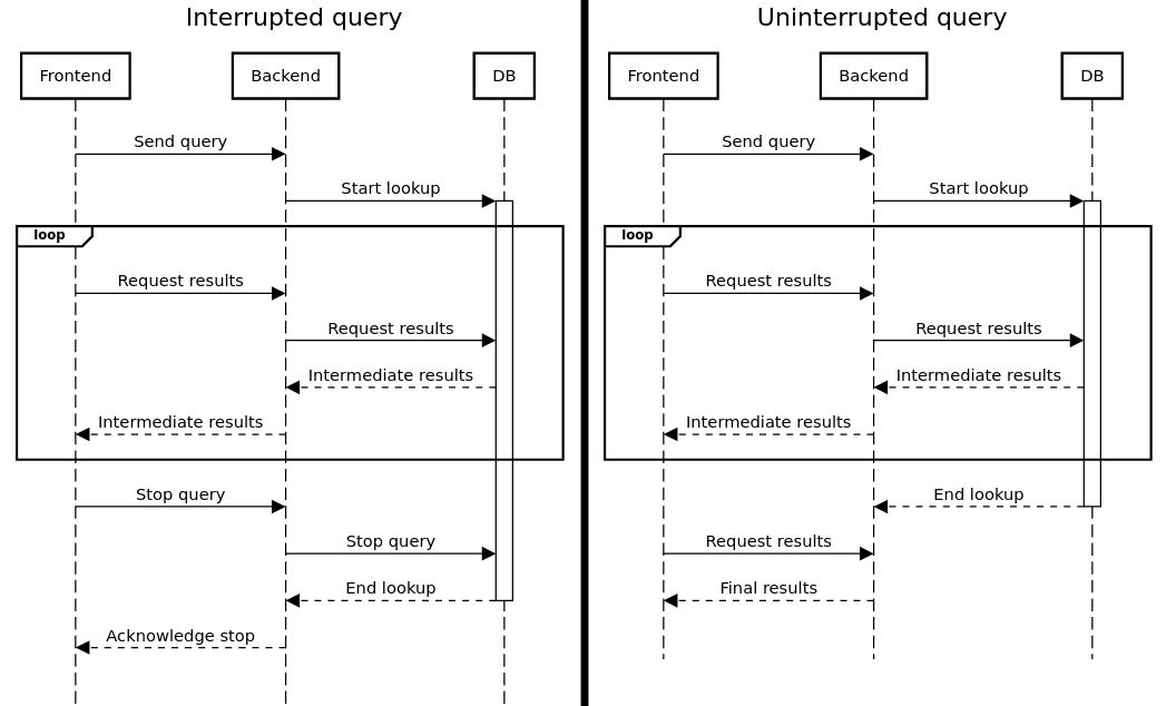
1. Provide increasingly meaningful partial results as the algorithm executes.The results will be streaming in from the backend and an optimal way of presenting them will have to be determined.
2. Allow users to focus the algorithm to subspaces of interest. The visualization will allow the user to focus in on parts of the query in the displayed results to request another query focusing on the selected
region.
3. Allow users to ignore irrelevant subspaces. The visualization will allow the user to suspend parts of it that provide sufficient information or suspend and hide parts that are deemed irrelevant.
4. Minimize distractions by not changing views excessively The animations will have to be informative of changes, but not drastic to be jarring.
5. Provide cues to indicate where new results have been found by analytics. It should be immediately obvious which part of the visualization is updating.
6. Support an on-demand refresh when analysts are ready to explore the latest results. Not as relevant for large scale databases, although still worth exploring. The ability to rerun queries should certainly be
present, perhaps along with the possibility of query suggestions from maintained history.
Details
- Student
-
TTTomas Tombakas
- Supervisor
-
 Anna Vilanova
- Secondary supervisor
-
OPOdisseas Papapetrou
- Link
- Thesis