Project: Visualizing flows in event logs
Description
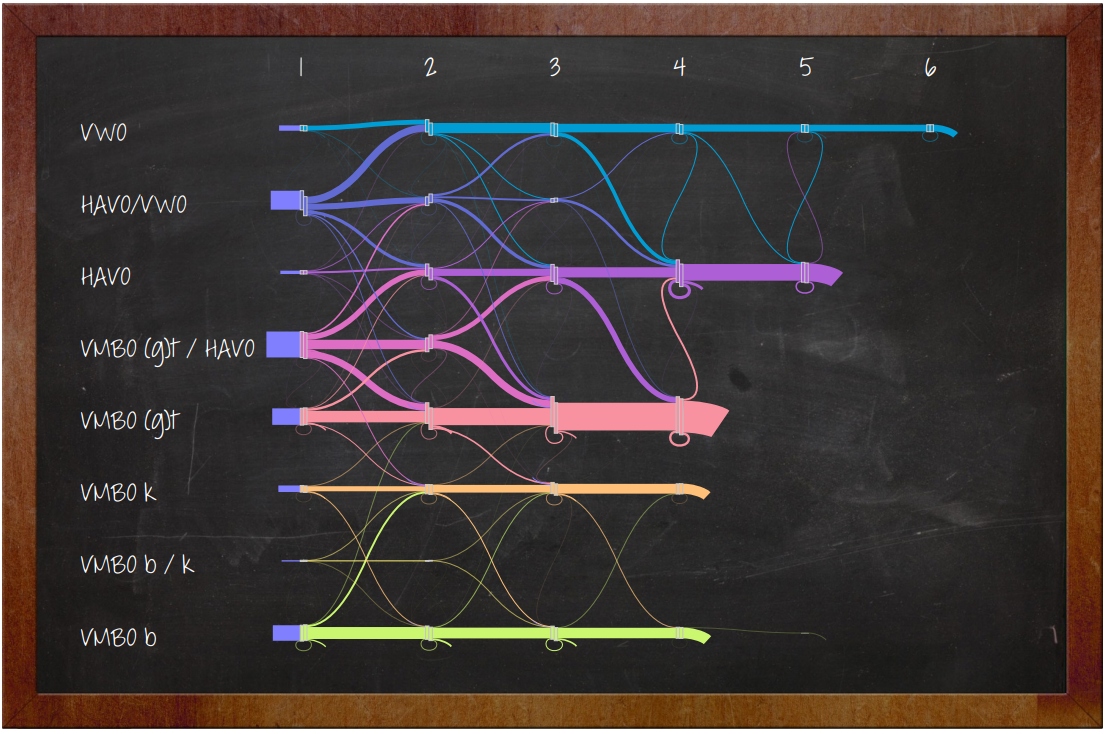
In this thesis we visualize event logs, or also often called process data. We start with the idea of visualizing the data as a flow. We use data from a high school to implement and test our system. The data analyst we obtained the data set from had several questions about the data that should be answered using our implementation. We use those questions as a starting point and define criteria based on the questions. Furthermore, we look at infographics for inspiration, since the result should be aesthetically pleasing.
Based on the structure of the data and the fact that we aim to visualize the data as a flow, we use a graph as an underlying data structure. The nodes and transitions in this graph are used to make a visualization similar to Sankey diagrams, where the nodes are laid out on a grid and the edges represent flow between the nodes. We extend the resulting visualization with several interaction possibilities, such as grouping or deleting nodes. Furthermore, we enable the user to answer more specific questions about the data by allowing the user to define a point of interest in the visualization. The resulting visualization only displays flows that go through these points. When answering the questions posed by the data analyst we conclude that user interaction, in particular letting the user define points of interest, is a powerful operation and helps with answering specific questions and with exploring the data. In our system we assume a flow direction of left-to-right, but this is a flexible assumption. In cases where the flow does not go from left-to-right, it is possible to rotate the nodes based on the direction of the flow. While our implementation is scalable, having many rows may result in a visualization where the flow is not easy to follow. In such cases it is possible to group nodes to make certain parts of the visualization more legible, or to apply binning on the value of the rows. While our system is scalable, this is relative, i.e., the more edges and nodes that are present, the longer it will take to show the visualization. If for instance the user wants to make a poster, waiting a long time might not be an issue, but for interactive usage the number of edges should be kept to a minimum. We also test the system on several other data sets. When we first look at generic process data, it is difficult to immediately get clear visualizations. However, using knowledge about the data and the process model behind it, we are able to generate more meaningful visualizations, but did not end up with a compact visualization. Finally, we conclude this thesis with the observation that our implementation works well for some data sets, and less well for others. Furthermore, we present several future work possibilities to improve on the limitations of the implemented system.
Details
- Student
-
STSeffer Turan
- Supervisor
-
 Jack van Wijk
- External location
- MagnaView - Eindhoven
- Link
- Thesis