Project: Cartographically inspired visualization of points sets
Description
The display of a large number of points, distributed over the plane, is a classic visualization problem. Available space is usually limited, which means a simple plot of the points (known as a scatter plot) quickly becomes cluttered and also suffers from problems such as overplotting. An alternative solution is the density plot, which depicts point density, visualized using different color tones or elevation in a 3rd dimension.
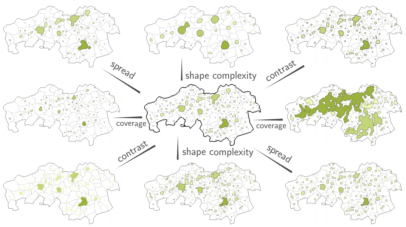
We develop and evaluate a model that is heavily inspired by the standard topographic map, where not each individual is shown, but rather grouped, and shown as cities or villages. We take this metaphor, and apply it to visualize arbitrary sets of points in a plane. Our research is based on two initial observations on standard topographic maps: regions (such as cities, green-land, and industrial areas) are displayed as simple shapes, with uniform colors and crisp boundaries, sometimes labeled and accompanied by a symbol hinting its size, and regions are more or less uniformly distributed over the map according to their local importance, e.g., it is possible that a relatively small city in a sparse area is shown while a larger city in a denser area is not.
We consider scalability of the model, i.e., the ability to generate visualizations at different levels
of detail, with smooth and predictable transitions (e.g., for interaction or animation purposes) to
be an important factor. This, along with what we consider important properties of the map (such
as region shape and size), is evaluated with a user study
Details
- Student
-
BABart van Arnhem
- Supervisor
-
 Jack van Wijk
- Link
- Thesis